
Role
Visual Designer
Prototyper
Tools
Figma
Sketch
Adobe After Effects
Platform
Responsive Web
Problem
GG Leagues is struggling to attract new members through its website branding. Current members are confused by the website’s infrastructure and experience difficulty accessing their team’s information and match schedules.
Goal
Refresh GG Leagues’ brand to engage current users and attract new ones. Improve site navigation by reducing the clicks required to access essential information such as rosters, match schedules, and player stats.
Exploring the Map
GG Leagues provided our team with existing UX wireframes as a foundation for UI design. From our analysis, we established core design principles:
•
Inclusive
•
Unified
•
Familiar
•
Visually Appealing


Mood Boards
We conducted a mood board preference test on Usability Hub with 27 participants to inform our style for site redesing. The results:
•
63% preferred a dark mode theme.
•
Simple grid layouts increased clarity.
•
Bright contrasting buttons improved visibility.
The Mini-Boss: Initial Mockups
Based on our research, we designed UI mockups emphasizing:
•
A dark mode inspired theme
•
Negative space and card layouts for readability
•
High contrast elements meeting AA accessibility standards

Usability Testing
We tested an interactive Figma prototype with 8 GG Leagues players, focusing on three tasks: sign up, checking player stats, and viewing opposing team stats.
Key Findings:
✅ Liked: Clear layouts (87.5% task success rate), dark mode (83% preferred), high-contrast buttons.
❌ Didn’t Like: Inconsistent card labels, distracting blue headers.
Desktop Updates
Original Design
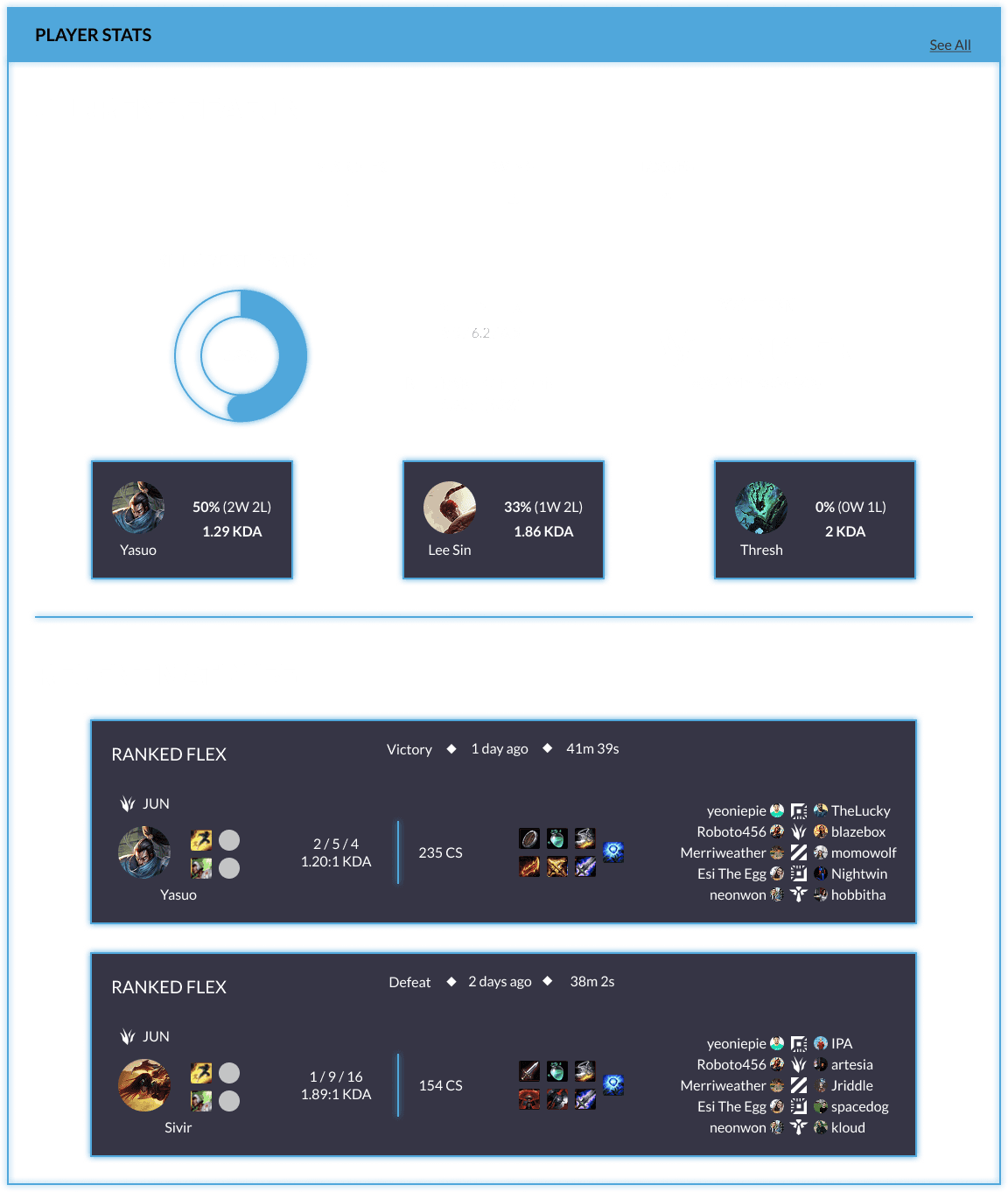
Eliminated distracting blue headers.
Updated Design
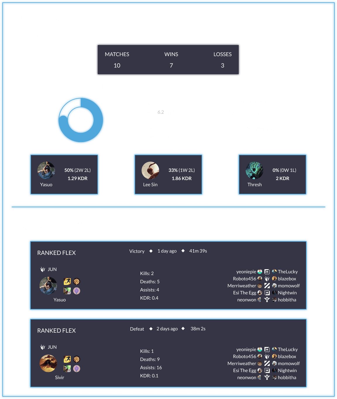
Improved labeling for stats and team information.


While we initially focused on desktop designs, GG Leagues later clarified that mobile mockups were also a priority. They required us to adapt our designs for smaller screens while maintaining usability.
Final Usability Testing
We updated the prototype with the new mockups and conducted a second usability test:
•
83% preferred the new mockups over the original site.
•
Users found the site easy to read and navigate.
•
Average difficulty rating: 1.25/5 (1 = very easy, 5 = very difficult).

Light Mode Alternative
Although dark mode was preferred, 30% of users liked the lighter theme. We designed a light-mode dashboard option as a future-proofing measure for GG Leagues.
Logo Redesign
While not part of the original scope, I noticed inconsistencies in the “Leagues” typography of GG Leagues’ logo. I redesigned it, removing the bevel and ensuring a cleaner, more cohesive style.
Testing on Usability Hub showed that 80% of 41 participants preferred the new logo. GG Leagues enthusiastically adopted it for their brand.
Original Logo

Updated Logo

Takeaways
•
Be Specific: Clear labeling prevents confusion.
•
Trust Your Team: Collaboration leads to better outcomes.
•
Plan Thoroughly: Align goals with the client upfront to avoid last-minute surprises.