
Role
Visual Designer
Prototyper
Tools
Figma
Sketch
Platform
Responsive Web
Problem
Students are overwhelmed by their workload and need accessible mental health resources to improve their well-being.
Design Goals
•
Provide students with easy access to mental health resources.
•
Create a simple, memorable user interface to encourage long-term engagement.
•
Develop a brand that is honest, approachable, and calming.
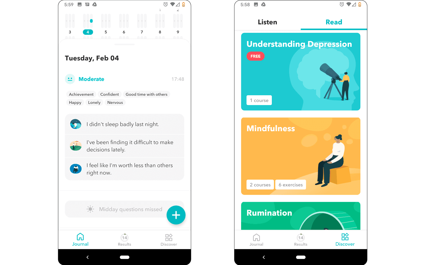
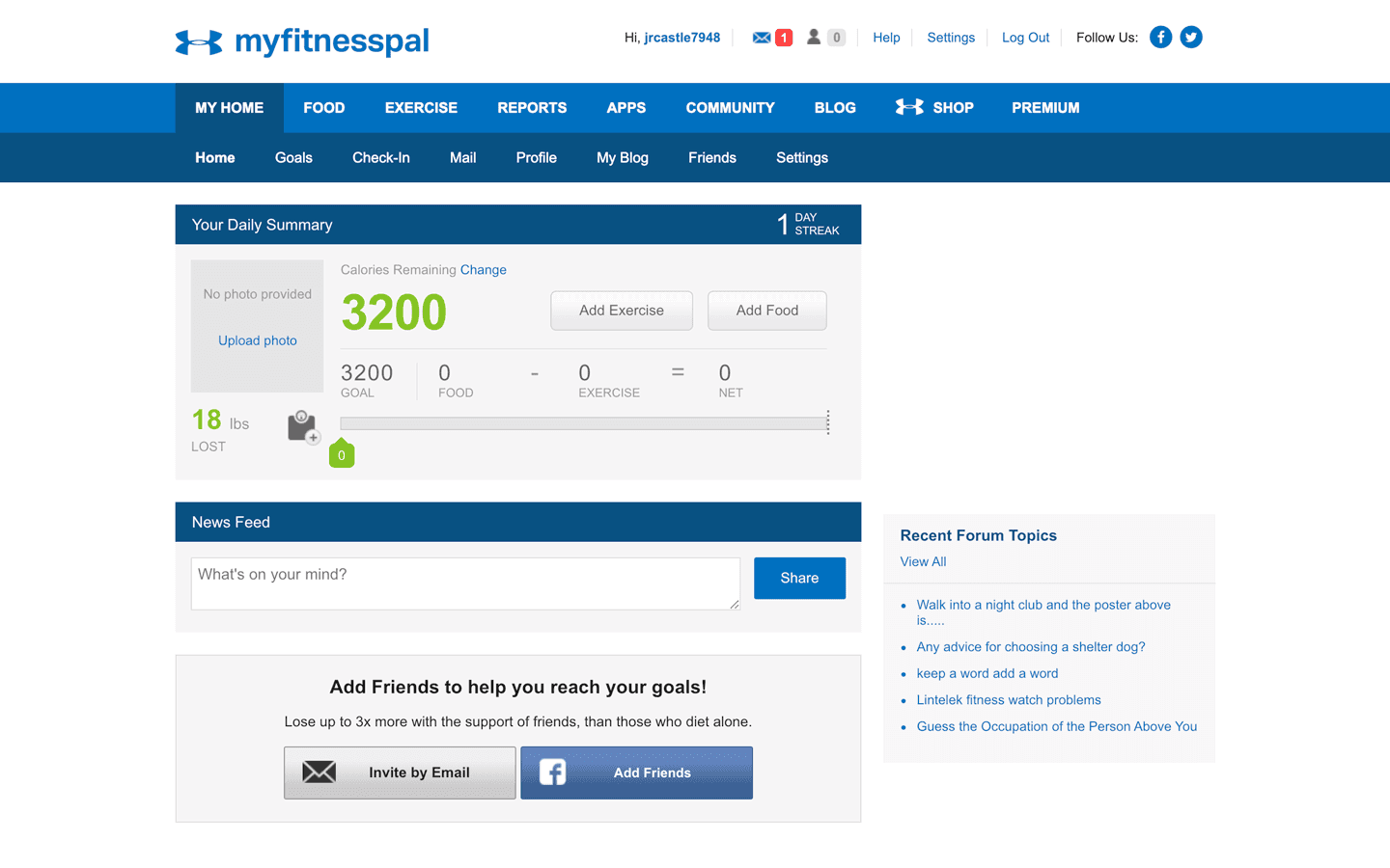
Competitive Analysis
I analyzed existing mental health platforms and identified common UI patterns:
•
Clean layouts utilizing ample white space.
•
Bright color accents for an uplifting tone.
•
Overly complex onboarding processes may deter users.
•
Premium-paid features that create accessibility barriers.
Since MoM offers free resources, I focused on adopting effective UI patterns while avoiding intimidating onboarding flows. The goal was to ensure simplicity and engagement.


Color Palette
A subdued blue color scheme, reinforcing
•
Calmness and tranquility
•
Trust and honesty
•
Stability and support
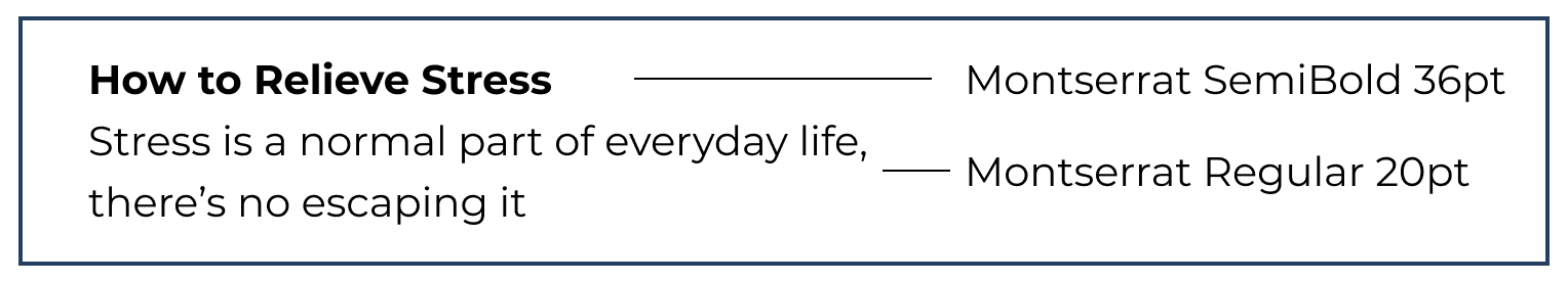
Typography
I chose Montserrat, a modern sans-serif font, to convey a friendly and relatable tone. Its 18 font styles allowed for a strong visual hierarchy while maintaining consistency.
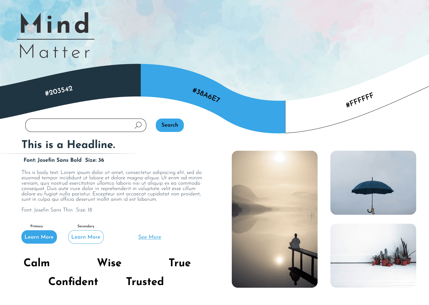
Style Tile
Before moving into mockup design, I created a style tile to finalize colors, font sizes, and imagery.


Approach
Starting with mobile wireframes ensured a scalable and structured layout. My UI decisions focused on the following:
•
White backgrounds and negative space for readability.
•
Accented colors for calls to action.
•
Rounded edges for a softer, inviting aesthetic.
User Testing & Iterations
I conducted usability tests, including 5-second and first-click tests, which revealed key issues:
•
The homepage CTA lacked clarity on MoM’s purpose.
•
The hero image was too large, obscuring other content.
•
Users mistakenly thought hero text was clickable.
Refinements:
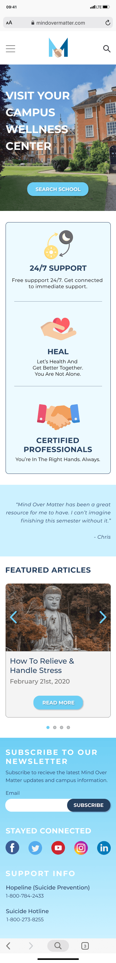
Modified CTA text to emphasize mental health resources.
Resized and bolded hero text to reduce confusion.
Adjusted hero image size to reveal more screen content.


Style Guide
Given MoM’s evolving content needs, I developed a comprehensive style guide to ensure consistency across future iterations.


Takeaways
•
Consistency is crucial: establishing clear guidelines improves brand identity.
•
User feedback drives improvement: iterative testing leads to better design.
•
Collaboration is essential: communication with the design team enhances outcomes.
•
Embrace established patterns: familiar UI elements increase user trust.